



BlogPerspective
The Dashboard Isn't Dying. It's Changing Jobs.
A software founder posted that his users had stopped visiting his dashboard. The replies were more interesting than the observation, and they describe exactly what happens to a promo platform when agents start doing the daily work.

When AI agents take over the daily work in software, the dashboard doesn't disappear. It changes jobs: from the place where people do the work to the place where they check, correct and understand what was done. For a promotional products platform, that makes permissions, a full change history, undo and clear ownership of every record more important than the screens where data used to be re-keyed.
In short:
- As agents handle daily tasks, the dashboard becomes the audit and recovery surface: permissions, history, undo and "why did it do that?"
- In promo, many screens exist to move information between quotes, orders and artwork by hand. That is labor agents can remove.
- The user experience doesn't go away when agents are the user. It moves down a layer, into schemas, permissions, errors and retries.
- A platform ready for agents needs scoped permissions, every write on a reviewable record, history on the record itself, a way back, and an owner for everything.
- Good screens still matter. For many people and many moments, a well-designed screen remains the fastest way to do the job.
A software founder I follow posted something last week that I haven't been able to put down. He said his users kept telling him: "I rarely go to your dashboard anymore." His team had spent years polishing that dashboard. His conclusion was that the same energy now needs to go into the machine-facing side of the product, and that everyone should go ask where their users actually touch the thing today, because the answer has probably moved. (Zeno Rocha, on X.)
It's an uncomfortable observation if you build software. It's a more uncomfortable one if you build software for an industry that runs on screens.
But the replies were where it got interesting, and they landed on something better than "the UI is dead."
Why does this matter more in promotional products?
Because in promo, our screens are where the re-keying happens.
That's not a criticism of any one platform, ours included. It's just what this industry's software has historically been for. A quote lives in one place, an order in another, artwork in a third, and the dashboard is where a person moves information between them by hand. I've written before about the hidden cost per order that creates, and why more stores shouldn't mean more work.
So when someone says users have stopped visiting the dashboard, the promo version of that question is sharper than it looks. If the daily work moves to an agent, what was the dashboard actually doing? And the honest answer, for a lot of screens in a lot of platforms, is: hosting labor that shouldn't have existed.
What does the dashboard become when agents do the work?
The best response in the thread argued that the dashboard doesn't disappear; it changes jobs. It becomes the audit and recovery surface. Fewer screens, but much better ones: permissions, history, undo, and a clear answer to "why did it do that?" The machine side handles daily use. The interface is where trust gets repaired when something goes wrong.
I think that's exactly right, and it's a much more demanding brief than the one most dashboards were built to.
The shift in one line
Daily use moves to the agent. The screen becomes where you check, correct and understand.
Notice what's now load-bearing. If an agent placed the order, the interesting screen isn't the order form. It's the record of what changed, who or what changed it, and whether it was allowed to. Those used to be the boring tabs. They just became the product.
Where does the user experience go when agents are the user?
It moves down a layer. The other line from the thread I keep repeating, because it's the one builders need to hear: the user experience didn't go away. It moved underneath. Schemas, permissions, tool errors, latency, retries: that's the new interface. And once agents are the user, bad tool semantics feel exactly like bad UX.
That reframing does a lot of work. It means "make the agent side good" is not a backend chore you delegate; it's a design discipline with the same standards as the visible one. A tool that's ambiguously named, or silently fails, or needs three calls to do one obvious thing, is the machine-facing equivalent of a confusing form. Nobody sees it. Everybody feels it.
Someone else in the thread asked the question I don't think anyone has a great answer to yet: how do you measure quality on that layer the way we learned to measure dashboard UX? Is there an equivalent of session replay for agent calls? I don't have a satisfying answer. I notice that we all developed a rich vocabulary for evaluating screens over twenty years and have roughly none for evaluating tools. That gap is going to matter.
What should a platform have when agents do the daily work?
Take the audit-surface idea seriously and it produces a concrete checklist, one that's worth applying to any platform you're evaluating, including ours.
A checklist for platforms where agents and people both make changes
| Requirement | What it means in practice |
|---|---|
| Scoped permissions | Which operations, on which data, for which accounts. Not "the integration has access." |
| Every write on the record | An agent's change lands in the same reviewable path as a human edit or an API call, with a diff before it goes live. |
| History on the record itself | What was edited, by whom, when, on which record. Not buried in a log file. |
| Undo and a way back | Archive rather than delete. Drafts rather than commits. |
| An owner for everything | Every catalog, store, order, discount and card has a named person to ask. |
Permissions that are real, and scoped. Not "the integration has access." Which operations, on which data, for which accounts. If an agent can do anything a login can do, you haven't granted access, you've handed over the keys.
Every write on the record. An agent's change should land in the same reviewable path as a human edit or an API call, with a diff of what it wanted to change, before it goes live. This is the part I'd refuse to compromise on. An action without a trace isn't automation, it's an unexplained event you'll be reconstructing later.
History on the thing itself, not in a log file. Every record in Brikl carries its own activity timeline: what was edited, who edited it, when, and the reference number of the thing it happened to. That was already the right design when only humans were editing. It becomes the answer to "why did it do that?" when they aren't.
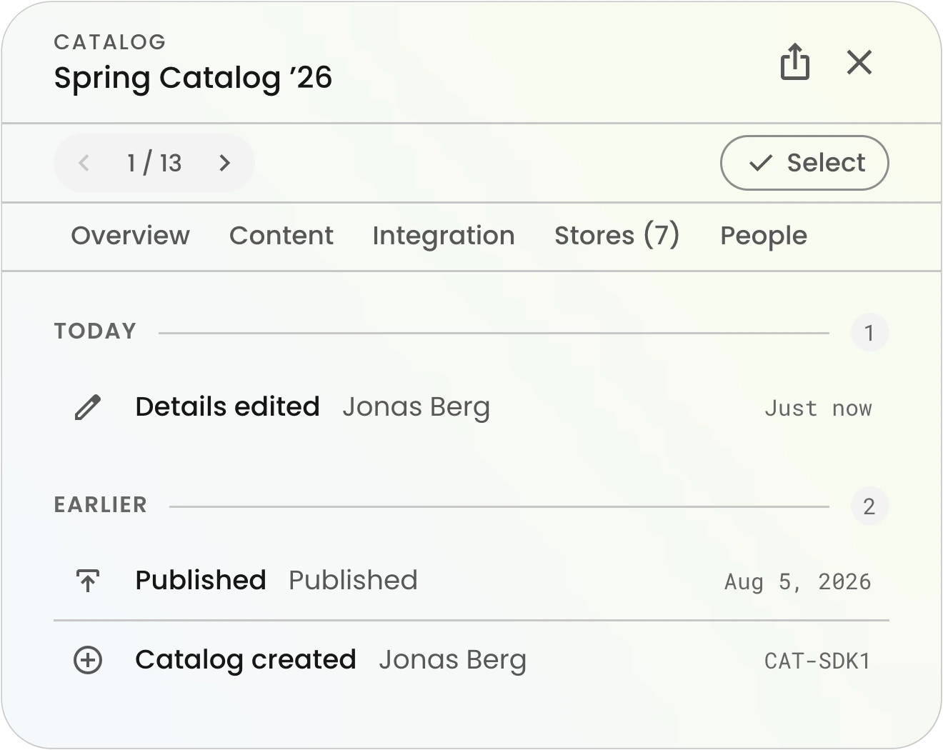
Undo, and a way back. Archive rather than delete. Drafts rather than commits. This turned out to matter more than we expected while building Brikl v3.0: nearly everything you create arrives as a draft, and nothing goes live because you clicked once. That was a decision about human confidence. It reads differently now.
And an owner. Every catalog, store, order, discount and card has a person attached to it. When something needs explaining, "who do I ask" should not be a research task.
Are screens still worth investing in?
Yes. There was a dissent in that thread too, and I don't want to skip it: someone pointed out that they'd just shipped a new version of their UI and users responded immediately and warmly. For plenty of people, in plenty of moments, a good screen is simply the best way to do the thing.
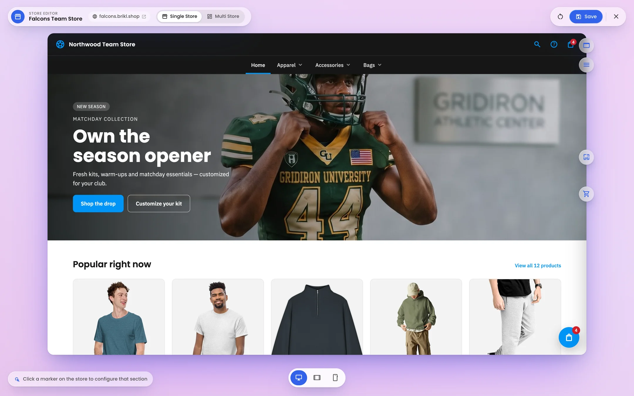
I believe that, and we act like it. This release, most of our effort went into the visible surface: records that open beside the list instead of replacing it, a store editor where you change the storefront by clicking the thing you want to change, and a create panel that makes any record in a couple of picks. None of that is agent work. All of it is a person, moving faster.
Which is the same conclusion I reached in the earlier piece in the AI series, arriving from the other direction: the screens don't go away, and intent becomes a second way in. Optionality isn't a hedge. It's the design.
Where do your users actually touch your product today?
The provocation in that original post is the part I'd pass on, because it survives whatever you conclude about dashboards.
Ask where your users actually touch your product today. Not where you'd like them to. Not where the roadmap assumes they do. For a distributor's clients, is it your store, or an email? For your own team, is it the console, or a spreadsheet next to the console? For the buyer with an AI client of their own, is it your platform at all, or a PDF you sent them?
The answer probably moved. It's worth knowing where to.
Running the business from your own AI is coming soon
Brikl for AI will let you run the business from your own chat, within the scopes you set. The reachability argument behind it is in Your Platform Should Meet You Inside the AI You Already Use.
Frequently asked questions
Will AI agents replace software dashboards?
Not entirely. As agents take over routine tasks, fewer people need a dashboard for daily work. But the dashboard remains essential as the place to review what an agent did, correct mistakes, manage permissions and understand why something happened. Its job shifts from doing the work to auditing and recovering it.
What is an audit and recovery surface?
It is the part of a software product where people check and fix work done by others, including AI agents. It typically includes scoped permissions, a history of every change on each record, a review step before changes go live, undo or archive options, and a named owner for each record.
Why does this matter for promotional products distributors?
Much of the work in promo software is moving information by hand between quotes, orders and artwork. If agents take over that daily work, distributors need confidence in what changed and who approved it. Platforms with clear history, permissions and drafts make that possible without re-checking every order manually.
What should I look for in a platform before letting an agent use it?
Check that access can be limited to specific operations, data and accounts; that every change from an agent lands on a reviewable record before it goes live; that each record keeps its own history; that you can undo or archive rather than delete; and that every record has an owner.
Is Brikl for AI available today?
Brikl for AI is coming soon. It will expose Brikl's platform actions as tools that an AI client can call, so you can run the business from ChatGPT, Claude, Gemini or Grok within the scopes you set. Every record in Brikl already carries its own activity timeline.
More from the blog

Perspective
Your AI Should Reach Your Systems
The industry spent a decade arguing about data formats and almost none on whether anyone's tools can actually reach each other. Buyers now arrive with an AI client of their own — and the question has changed.

Industry
We Standardized the Catalog. Now We Need to Standardize the Order.
Supplier feeds carry the style, the color and the price. The decoration half of the order still arrives by email, one order at a time. At GXN in Kitzbühel, we talked about who fills that gap, and what it would take to close it.

Guide
Self-Service Swag Ordering for Employees
The office manager shouldn't be the swag department. Self-service ordering lets employees get what they need without a request, a form or a bulk buy.